1st December 2019 in 15:57

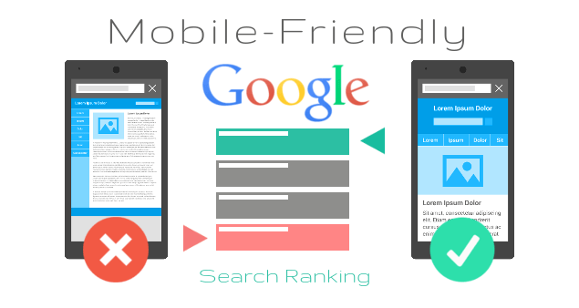
More and more people prefer smartphones to computers, and 19% of users access the network from mobile devices alone. In Google search this year, the proportion of mobile queries reached 60%. In addition, it became known that Google will encourage mobile-friendly sites, increasing its ranking in search results on smartphones. In these conditions, for many, the question arises of the need to create a high-quality mobile site. Google conducted a study and found out the level of conversions for mobile and non-mobile sites, as well as the dependence of conversions on various factors. And it provided recommendations on how to avoid common mistakes when developing a mobile site. A joint study by Google and Calltouch analyzed 1,500 sites in 20 business sectors. The convenience of sites for mobile users was determined using the Mobile-friendliness test, which monitors how well the site displays on mobile devices (various characteristics are checked, such as font size, the proximity of elements, etc.). In addition, a test was conducted for errors in the field of convenience and speed of sites. As a result of the analysis, we studied the distribution of conversions on business-oriented sites and their dependence on the quality of the company’s mobile site.
Mobile-friendliness boosts site conversion
It’s not enough just to have a website for mobile devices, it is important that it is user-friendly. The usability test showed that only 35% of the sites analyzed are mobile-friendly. And the share of their mobile traffic is only 30%, which is exactly half the share of requests to Google from mobile devices (60%). All this suggests that businesses are still lagging behind the trends that consumers set. The study found that the conversion rate from mobile sites is on average 15% higher than from non-mobile. Thus, the mere fact that a business has a website for mobile devices increases the average conversion from 1.64% to 1.87%. At the same time, sites that showed the best results in the test on mobile-friendliness gave a conversion increase of up to 50%. Thus, in order to reach a rapidly growing audience of active mobile users, increase the conversion rate from smartphones and stand out among competitors, companies in various fields should already think about launching mobile-friendly sites. In addition, promoting a mobile site is now cheaper – the level of competition in mobile search advertising is on average 23% lower than in search advertising on desktops, and the average cost per click on smartphones is 30% cheaper. Mobile advertising opens up new opportunities for marketers. After all, it is smartphones that allow brands to remind themselves at the moment when the user is ready to make a decision.
Quality Mobile Site Criteria
There are many criteria for a high-quality mobile site, among the main ones – simple and functional navigation, placing a call to action on the main page, easy filling out forms, a noticeable search field, creating filters, etc. One of the most important criteria is the speed, which has an even greater impact on conversion site than usability. Errors related to site speed can halve the conversion of incoming traffic to calls.
5 STEPS TO CREATE A MOBILE SITE
1. Homepage and site navigation
Calls for action should be placed in the foreground Mobile users often do not notice the menu, so calls to action should be placed where they will be seen for sure. The menu should be concise and informative. The number of menu items should be reduced to a minimum. Return to the main page should be convenient Users most often expect the logo to act as a button to go to the main page. Advertising should not be intrusive It’s important that the ad units do not interfere with the movement of the site and differ from calls to action.
2. Search the site
The search box should be visible. According to most study participants, it is most convenient to use the search text box at the top of the page. Site search results should be as relevant as possible. Users rate the search based on the first search results, so the most relevant results should be displayed first. You also need to add features such as autocomplete and error correction. Add filters to make your site search more convenient. Add filters that limit your search results. Help the user find what he is looking for Ask the visitor a few questions in advance (for example, about the gender and size for the clothing site), then he will see more relevant results.
3.Conversions
Give the user the opportunity to explore the product If you require visitors to register on the site too early, this can negatively impact conversions. Before reporting their personal data, users want to familiarize themselves with what is offered on the site. Allow making purchases without registration Describe the benefits of registering to interest users, but let them make purchases without it. According to many, making a purchase without registering is more convenient and quick. Use the available information to speed up the process. Save and then substitute the data of registered users. Add an interactive phone number next to complex activities So that users can immediately call and clarify incomprehensible moments. Make sure that the user can complete the conversion process on another device Some mobile users collect information and return to them later. Suggest a simple way to complete the conversion process on another device: for example, send information by e-mail or add goods to the basket.
4. Filling out the forms
Optimize the input of information. Show the numeric keypad when entering numerical data, add the function of automatic transition between fields. Choose the easiest way to enter data for each task. Use the toggle icons or drop-down lists instead of text input fields. Elements clicked by users should be large enough and understandable. Suggest choosing a date on the calendar . Enter dates using a calendar with clear instructions. Informative signatures and real-time verification can reduce the number of errors <br> There should be noticeable and clear signatures next to the fields, and the form must be checked for errors when filling out so that users can correct them before submitting. Forms must be thought out. The form should have as few fields as possible, previously entered data should be substituted automatically. If the form includes several sections, place a progress bar at the top of the page.
5. Usability
Optimize all components of the site. A site is easier to use if all of its pages are optimized for mobile devices. Do not force the user to zoom in. If you want to zoom in to view, the user can skip the call to action. Product images should be drop-down. Add high-quality close-up shots for product photos. Recommend the optimal screen orientation Tell the user which screen orientation is best for viewing the site, but make sure that the calls to action are clearly visible regardless of the mode. Use one browser window. Make sure that calls to action open in the same browser window, and design your site so that users do not have to switch between windows. Avoid the expression “Full version” Choosing between the “full” and “mobile” versions of a site, study participants often chose the full version because they thought the mobile version was a stripped-down version. Use the expression “version for computers” – then it will be clear that both options are equivalent.